Creating a modern dark blue business website design is one of the most effective ways to present a professional, trustworthy, and premium brand online. Corporate businesses, consulting firms, and service-based companies often prefer dark blue layouts because they communicate authority, stability, credibility, and long-term reliability.
In today’s competitive digital space, a business website must do more than just look good. It must convert visitors into clients, build trust instantly, and deliver a smooth user experience across all devices. In this guide, I’ll break down the exact structure used in a high-converting dark blue business homepage and explain how you can build a clean, responsive, and conversion-focused layout step by step.ProtfolioProtfolio You can explore the live demo here:
Why Choose a Dark Blue Business Website Design?
Before diving into the layout structure, it’s important to understand why dark blue works so well for corporate websites.
Dark blue is widely used in professional branding because it represents:
- Trust
- Professionalism
- Stability
- Authority
- Confidence
When combined with modern UI structure, proper spacing, and strategic content placement, it creates a premium business website appearance that appeals to high-value clients and decision-makers.
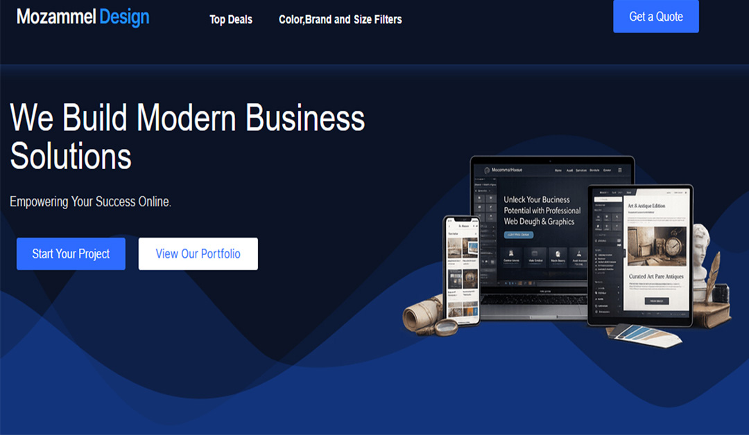
Step 1: Build a Strong Hero Section
The hero section is the most important part of any business homepage because it creates the first impression.
A high-converting hero section should include:
- A clear, benefit-focused headline
- Supporting subheading explaining value
- Primary call-to-action button
- Optional secondary button
- Clean gradient or layered background
In this dark blue layout, the hero section uses a smooth gradient background and a responsive device mockup image to visually communicate digital services and professionalism.
Step 2: Add a Brand Trust Section
Right below the hero section, adding brand logos or client logos builds instant credibility.
Best practice for this section:
- Keep it minimal
- Use grayscale logos
- Maintain equal spacing
- Add subtle background contrast
This increases trust without overwhelming the design.
Step 3: Design a Clear Services Section
A professional corporate website must clearly explain its services.
Each service card should include:
- Icon or visual symbol
- Service title
- Short, benefit-driven description
- Clean shadow or hover effect
- Equal padding and spacing
Avoid long paragraphs. Keep the layout structured and easy to scan.
Step 4: Create an About Section with Authority
Your About section should position your brand as experienced and reliable.
Include:
- Years of experience
- Core strengths
- Client-focused benefits
- Supporting image or visual
Using bullet points with icons improves readability and enhances visual clarity.
Step 5: Showcase Recent Projects
A portfolio or recent projects section builds social proof and demonstrates real capability.
This section should include:
- 2–3 project previews
- Clean image presentation
- Optional hover interaction
- “View All Projects” button
Make sure the layout remains responsive across desktop, tablet, and mobile devices.
Step 6: Add Testimonials for Social Proof
Client testimonials significantly increase conversion rates.
Best practices:
- Use real client images if available
- Include star ratings
- Keep testimonials concise
- Maintain equal card height
This creates emotional trust and strengthens brand credibility.
Step 7: Include a Strong Call-To-Action Section
A full-width call-to-action section encourages visitors to take the next step.
It should include:
- Strong headline
- Clear action button
- Contrasting background
- Proper spacing
This is where visitors decide whether to contact you or request a service.
Step 8: Professional Footer with Contact Form
A modern business footer should contain:
- Company information
- Quick navigation links
- Contact form
- Clean multi-column layout
Typography and spacing must stay consistent to maintain professional balance.
Responsive Design is Mandatory
A modern business website must be:
- Fully mobile responsive
- Tablet optimized
- Fast loading
- Cleanly structured
- SEO-friendly
Using container-based layout systems such as Elementor containers or Flexbox ensures consistency, flexibility, and scalability.
Final Thoughts
A modern dark blue business website design is more than just color. It’s about structure, clarity, hierarchy, trust, and conversion-focused layout.
If you’re serious about building a strong online presence, focus on:
- Clean UI design
- Clear messaging
- Logical content structure
- Conversion-driven sections
- Responsive performance
- Explore the full live demo here:
If you need a professionally structured, responsive, and conversion-optimized business website, feel free to get in touch.